While it’s true the incredible growth of the mobile internet has been fueled by better and better devices, mobile still remains a very constrained environment. Screens are small, networks are unreliable, and people can find themselves in all kinds of situations when they pull out their mobile devices. But these constraints are not only good for business, they’re good for design as well.
This is especially true if you subscribe to the adage that design is the process of gradually applying constraints until an elegant solution remains. In other words, embracing constraints (rather than fighting them) will ultimately get you to better designs.
Though the topic of available screen real estate on the desktop was hotly contested for many years in the web design community, we finally settled on 1024×768 pixels as our beachhead. Today, mobile takes our sunny beach and cuts it down to little more than a sandbox.
The first volley of smartphones running iOS, Android, and WebOS mostly stuck to a 320×480 pixel resolution, which meant 80% of the screen space from the desktop was missing. So 80% of the links, ads, text, images, and more from our desktop designs had to find a new home or disappear altogether. There simply wasn’t room for them on a mobile screen. And that’s…terrific.
When you consider the amount of useless navigation, content fluff, and irrelevant promotions that litter a typical web experience, you realize why the mobile diet can be good for both businesses and customers. Once people use the mobile version, it’s not uncommon for them to pine for the desktop version to be “that simple.”
To see why, let’s look at the Southwest Airlines website (fig 2.1), which seems to exemplify the everything-including-the-kitchen-sink problem. Adding things to a website is relatively easy so lots of things get added—especially when multiple stakeholders are involved.
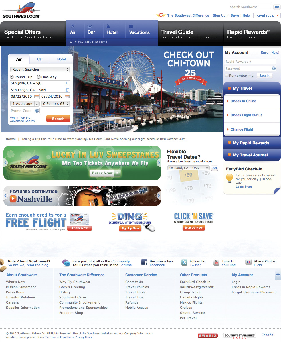
Fig 2.1: The Southwest Airlines website makes sure every pixel is filled with competing messages and calls to action.
Different internal departments, feature owners, businesses, and individuals have different requirements for websites. So web teams are often left trying to balance many promotions, interactions, content modules, navigation options and more in a single layout. On a 1024×768 screen there are lots of pixels to fill!
The mobile experience (in this case, Southwest’s native iPhone application), on the other hand, has a laser-like focus on what customers need and what Southwest does: book travel, check in, check flight status, check miles, and get alerts (fig 2.2). No room for anything else. Only what matters most.
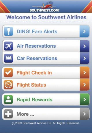
Fig 2.2: The Southwest Airlines iPhone application only has room for what actually matters.
Losing that much screen space forces teams to focus. You have to make sure that what stays on the screen is the most important set of features for your customers and your business. There simply isn’t room for any interface debris or content of questionable value. You need to know what matters most.
In order to do that you need to really know your customers and your business. Designing for mobile forces you to get there, like it or not.
To further illustrate this point, let’s look at the popular photo-sharing site, Flickr. While you may be familiar with Flickr, chances are you are not familiar with all of it. Over the years, the site has grown to boast over 60 navigation options in its top menu alone (fig 2.3).
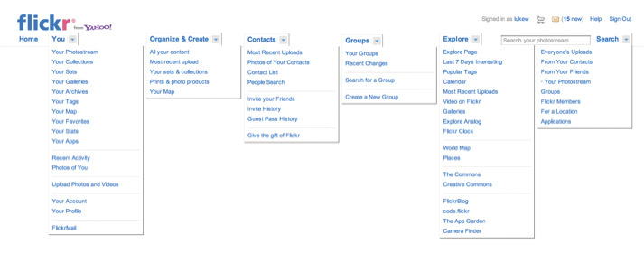
Fig 2.3: All of Flickr’s top-level menu options—all at once.
When it came time to design their mobile web experience, the Flickr team was able to focus these 60 plus options into six. How did they do it? By knowing what their customers did on the site and why. Most Flickr users like to check in and see what’s happening with their photos; see new photos from people they know; and explore interesting images from across the site. The mobile website put the focus on these key actions front and center (fig 2.4).

Fig 2.4: Flickr’s mobile web experience takes 60 plus navigation options down to six.
If you design for mobile first, you can create agreement up front on what matters most. You can then apply the same rationale to the desktop (and any other) experience of your web product. If you can agree on the most important set of features and content for your customers and business, why should that prioritization change with more screen space?
There are, of course, differences based on mobile and desktop usage patterns; but the core value of a web service remains the same across both formats and beyond. In fact, you’ll quickly find your customers will expect to do just about everything (within reason) on mobile. Especially those who primarily (or only) use their mobiles to get online. So don’t dumb things down on mobile—focus on what really matters most anywhere people can access your website.
With mobile first, the end result is an experience focused on the key tasks users want to accomplish without the extraneous detours and general interface debris that litter many of today’s websites. There simply isn’t room in a 320×480 pixel screen for elements of questionable value.
Though people try to use their mobile devices just about everywhere (yes, there too!), mobile networks aren’t always there to support them. Even when they are, coverage can be expensive (depending on your data plan) and spotty—leading to slower connections and longer, frustrating wait times.
Designing for mobile means designing for this reality. Anything that can be done to increase performance on mobile should be done. At the highest level that means sending less stuff and using whichever browser and server technologies are available to you to speed things up and reduce people’s monthly carrier bills.
You can require mobile users to download less by managing both the size and number of files (and thereby HTTP requests) you are sending to a device. On mobile devices, each HTTP request can be more costly because of mobile network latency. So make sure you:
Speed isn’t just important on mobile. Testing done by Amazon, Yahoo!, Microsoft, and others has consistently shown that even very small delays (100ms) on the desktop can turn users away. Long-term studies by Google found that slow performance has lasting effects, reducing people’s activity for five weeks even after a delay has been repaired. So performance matters on the desktop, too.
If you focus on mobile first and make things fast enough for spotty mobile networks, your websites and applications will be blazingly fast on the desktop and your customers will love you for it—just another advantage to embracing mobile constraints up front.
In its simplest form, context is the circumstances under which something happens. For example, desktop computers are most often used at a desk (in an office or home); with a persistent connection to power and the network; in relative privacy; from a seated position; and so on. While someone can certainly use a mobile device for a long period of time while seated at a desk, there is a much wider set of circumstances possible because mobile devices are naturally portable.
Since mobile devices are (just about) always with their owners, location and time play a big role in how they are used. And that context has a big impact on design. When you design for mobile you are designing something that can be used anywhere and anytime.
When many people first imagine designing for mobile, they picture a hurried businessman on the street. While that can be a real use case to consider, the places where mobile devices are frequently used are much more diverse. A recent survey looked at where people used their smartphones and found:
The fact that 84% of people used their mobile device at home is telling. Catching a quick glance at your email at home is perhaps a bigger part of the mobile story than our businessman on the go. What both situations have in common, though, is that we’re unlikely to get someone’s full attention.
When reflecting on a lot of mobile usage patterns, I like to imagine people as “one eyeball and one thumb.” One thumb because they are likely to be holding their mobile in one hand and using a single thumb to control it; one eyeball because in many locations where mobile devices are used we only have people’s partial attention.
They’re waiting in line and sneaking a peek at a sports score; they have a baby on one arm and their mobile in the other; they are on a crowded subway on the way to work; or they are lounging on the couch with the TV running in the background. Thinking “one eyeball, one thumb” forces you to simplify mobile designs so they can be understood and used in these kinds of situations and more.
Even in distraction-free environments where focused use is possible, a simplified mobile experience goes a long way to making people feel comfortable and relaxed.
While people can technically use their computers at any time, there are different periods of time during the day when different devices come out more often. To illustrate, the graph in fig 2.5 shows the number of articles Read It Later users read each hour on their desktop and laptop computers. The number of reads grows more sharply until noon and then begins to fall off until after work (6–9 p.m.).
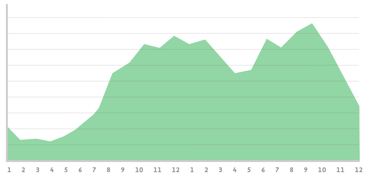
Fig 2.5: When people are reading saved articles on their computer (Source: Pocket).
The second graph shows the number of articles read by iPhone users each hour (fig 2.6). There are four major peaks: 6 a.m. (breakfast); 9 a.m. (the morning commute and start of workday); 5 p.m.–6 p.m. (end of the work day and the commute home); 8 p.m.–10 p.m. (couch time, prime time, bed time).
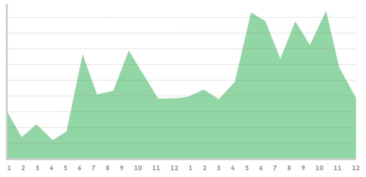
Fig 2.6: When people are reading saved articles on their iPhone (Source: Pocket).
Clearly computer time is not mobile time. Nor is it tablet time. To further illustrate how different devices can impact website or application usage, we can look at when people are reading Read It Later articles on their iPad (fig 2.7). While there is a small spike in the morning and steady use throughout the day, the bulk of iPad reading happens in the evening—in bed. I swear I’m just reading web design articles!
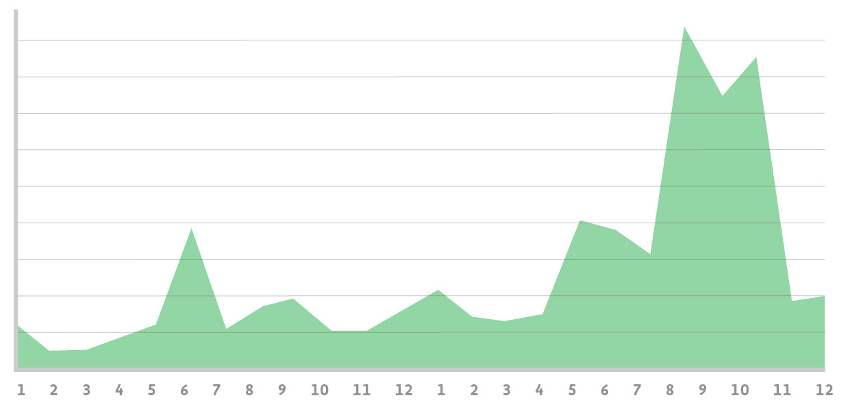
Fig 2.7: When people are reading saved articles on their iPad (Source: Pocket).
So different devices often do come out at different times. In some cases, it’s just a matter of proximity. What’s the closest device I can use to get what I need done? In many other cases, though, it’s because different devices are better suited to specific types of tasks. This becomes clear when you look at computer and mobile usage together in one chart (fig 2.8).
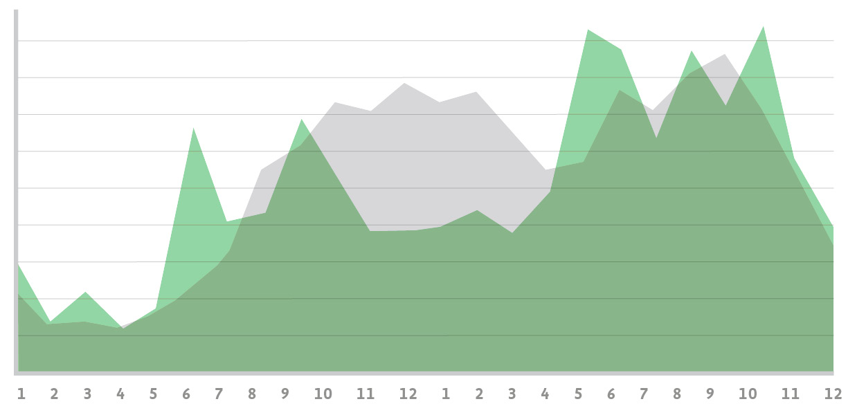
Fig 2.8: Super-imposing when people read saved articles on their computer with when they read them on their iPhone (Source: Pocket).
This chart does a nice job of illustrating that people often use their mobile devices in shorter bursts (that’s why the peaks are sharper) throughout the day. Rachel Hinman at Nokia has a great analogy that contrasts mobile behavior with desktop behavior; she says the desktop is “diving” while mobile is “snorkeling”.
Web applications that align well with shorter, burst-like behavior by providing their customers with quick, up-to-date, and highly relevant updates throughout the day are growing like weeds on mobile. Access to Facebook through mobile browsers grew 112% in one year. Access to Twitter through mobile browsers experienced a 347% jump in just one year. Both of these services are perfect for snorkeling in a sea of your friends’ status updates.
But note that in both diving and snorkeling, you’re looking at fish underwater. While the time and place people interact with mobile may be different, the core value of your website stays the same. So once again, don’t deny people content and features just because they’re on a mobile device.
Mobile comes with a natural set of constraints that may at first seem limiting. Screens are small, connections are slow, and people often only give you their partial attention or short bursts of their time. Designing for mobile first forces you to embrace these constraints to develop an elegant mobile-appropriate solution. But the benefits go well beyond mobile.
Small screen sizes force you to prioritize what really matters to your customers and business. There simply isn’t room for anything else. Slow connections and limited data plans require you to be vigilant about performance, resulting in fast-loading websites everywhere.
Location and time act as constraints on the mobile design process because they force you to think differently about how people will use your products throughout their day. They also create new opportunities for engagement that can help you innovate. So let’s talk about the new things mobile allows you to do.