The natural constraints of mobile devices, networks, and usage patterns help focus and simplify mobile experiences. But designing for mobile isn’t just about embracing limitations—it’s also about extending what you can do.
People can (and do) use their mobile devices anywhere and everywhere. That opens up new ways for us to meet customer needs and business goals. When these opportunities come together with the technical capabilities now present in many mobile devices, lots of innovative experiences can emerge.
Since that sounds like something a corporate PowerPoint presentation would say, let me illustrate the idea with a story.
When I was last in London, I wanted to take in a few sights. Having been there before, I knew the London Underground (or Tube) was the best way to move around, but I didn’t know where to find the stations closest to me. Solving this problem on my laptop only required a quick search that dropped me off on the London Transport site (fig 3.1).
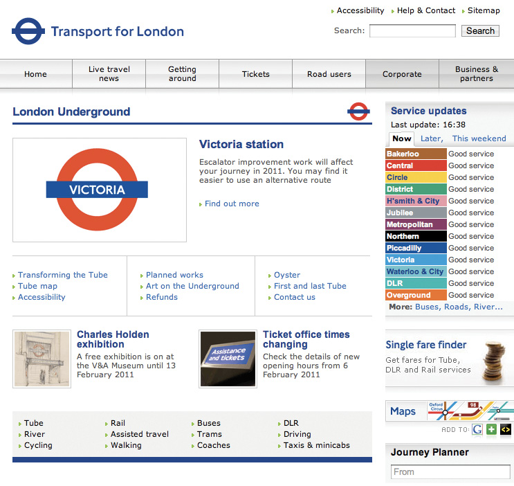
Fig 3.1: The Transport for London website’s home page.
Once here, I easily found a link to the Tube map and arrived on a web page dedicated to “Maps” with a link to the “Standard Tube Map.”
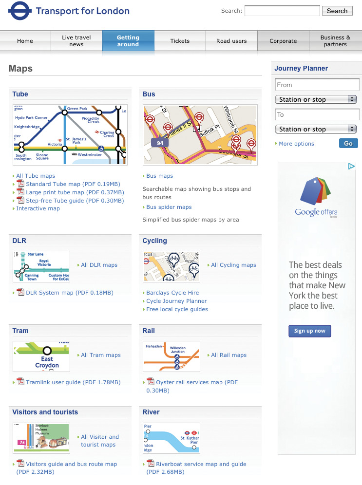
Fig 3.2: Years of web design best practices at work on the Maps page.
Now let me pause here for a moment and point out that a lot of web usability and information architecture best practices have been applied to the London Transport site (fig 3.2). It’s clear what’s a link, large images provide visual cues about each section, and the links have even been annotated with PDF icons and file sizes to let you know what’s behind them. I’m also sure they thought a lot about how to organize the various pages on the site and how people could move between them. So it wasn’t very hard for me to find the right information and access the PDF map of the Tube (fig 3.3).

Fig 3.3: The PDF of the Tube map that ended my search.
Now let’s contrast this experience of finding nearby Tube stations on the desktop by doing the same thing using a native mobile application called Nearest Tube. Nearest Tube uses a few mobile device capabilities to deliver a very different experience. In particular, it relies on access to a mobile’s location detection services, digital compass (or magnetometer), video camera, and accelerometer.
Location detection finds your position on a map, a digital compass determines the direction you are facing, and the video camera allows you to display digital information over your current field of view. So the experience of finding the nearest Tube station using Nearest Tube consists of opening the application and just looking at the screen (fig 3.4).
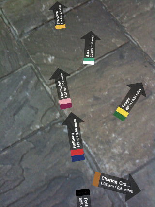
Fig 3.4: The Nearest Tube application points out stations near you using a mobile device’s video camera and digital compass.
Overlaid on your current view of the world are markers pointing to the Tube stations closest to you, the routes they service, and how far away from you they are. The application also uses an accelerometer (a sensor that measures how the device is moving) to change the information you see depending on where you point the camera. Position it in front of you and you see more detailed information about nearby stations; lift it up higher and get the same information about stations further away (fig 3.5).
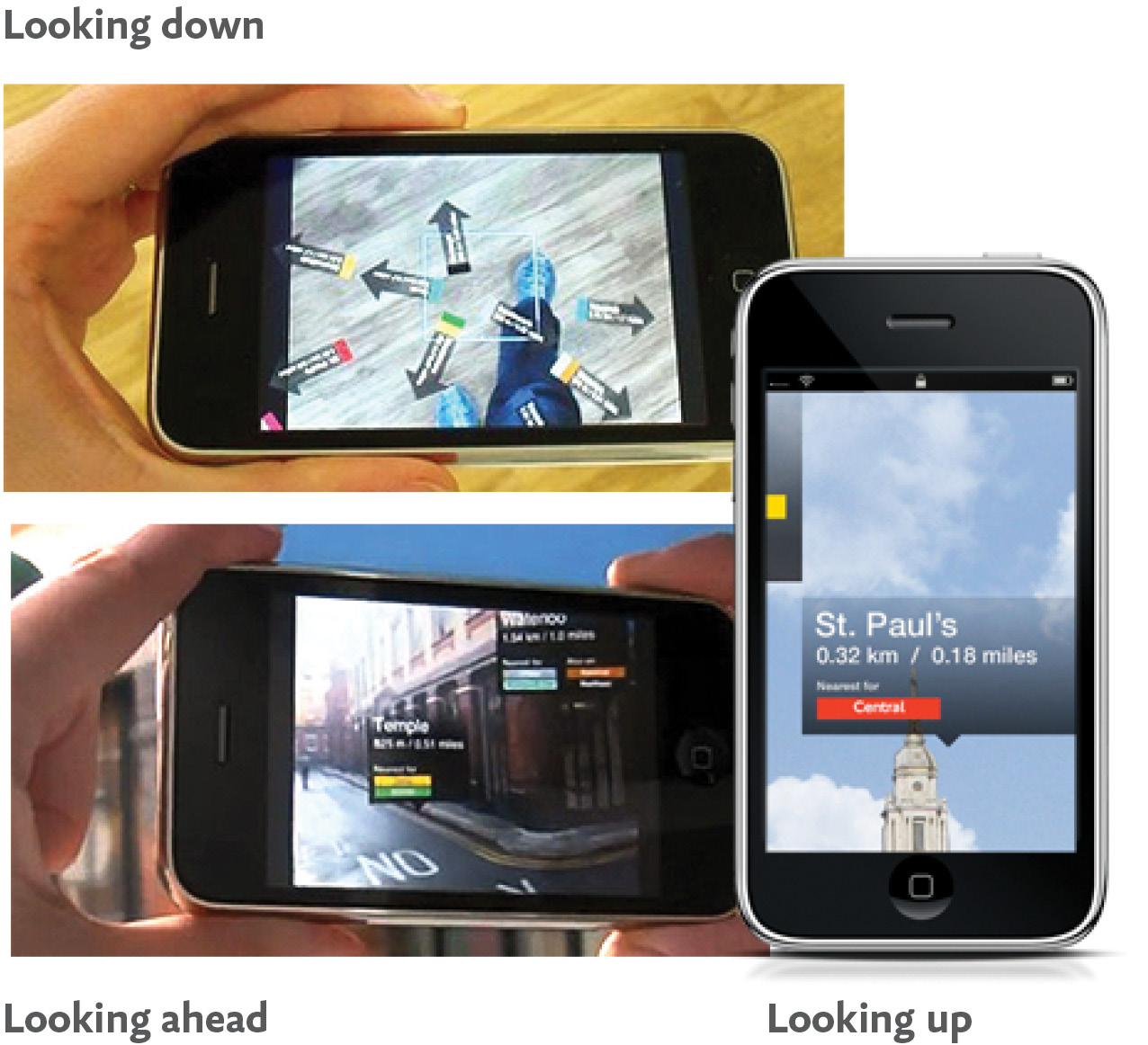
Fig 3.5: Nearest Tube provides different information depending on how you position your mobile device.
Now I’m not suggesting this mobile “augmented experience” is better than the desktop web one we just walked through—because, frankly, both have usability issues. But, wow is this different. The desktop website and this mobile application solve the same user need in dramatically different ways.
Nearest Tube uses mobile device capabilities (camera, location detection, magnetometer, and accelerometer) to really innovate in what seems to be a simple use case. And this is what mobile capabilities allow you to do: reinvent ways to meet people’s needs using exciting new tools that are now at your disposal.
Before we get ahead of ourselves, not everything that Nearest Tube has done in their native mobile application is currently possible in all mobile web browsers. Half the capabilities we just saw used (location detection and device orientation) are mostly available, while the other half (video camera and magnetometer) are mostly not available in smartphone web browsers at the time of this writing. So (as I pointed out earlier) there are still reasons to build experiences natively. But if you consider the glass half full, there are a lot of interesting new capabilities available in mobile web browsers, and more are being added all the time.
It’s also worth pointing out that the most important opportunities come from people’s needs and not from any specific hardware features. Technical capabilities can help us meet these needs in new and interesting ways, but building things just because we can usually doesn’t help our customers.
On the desktop, we can be about 99% sure we know the country a visitor to our website is in. While that has its uses, it doesn’t really give us much to work with. Most smartphones, on the other hand, have several ways to detect someone’s location that can be accessed from within the browser. Table 3.1 (assembled by Rahul Nair) provides a quick overview of the techniques at our disposal.
| Accuracy | Positioning Time | Battery Life | |
|---|---|---|---|
| GPS | 10m | 2–10 minutes (only indoors) | 5–6 hours on most phones |
| WiFi | 50m (improves with density) | Almost instant (server connect and lookup) | No additional effect |
| Cell tower triangulation | 100–1400m (based on density) | Almost instant (server connect and lookup) | Negligible |
| Single cell tower | 500–2500m (based on density) | Almost instant (server connect and lookup) | Negligible |
| IP | Country: 99% City: 46% US, 53% International Zip: 0% |
Almost instant (server connect and lookup) | Negligible |
Table 3.1: An overview of the different ways a modern mobile device can detect your location. Smartphones make hybrid use of GPS, WiFi, and cell tower triangulation; laptops and desktops use WiFi, IP, and only rarely GPS.
While cell towers can be used to locate a modern feature phone, a device like the iPhone relies on WiFi beacons two-thirds to three-quarters of the time it locates itself. WiFi beacons (based on where WiFi hotspots are located) work indoors, don’t use up additional battery life, and can find locations almost instantly. GPS units have problems on all three fronts, but they have much higher location accuracy. When you need a foolproof location, GPS and cell towers are a much surer bet.
But don’t worry too much about these issues. The web browsers that provide location APIs will simply give you the most accurate location information they have from the device when you ask for it.
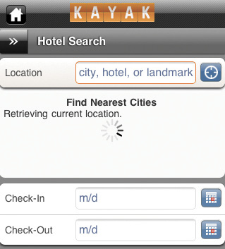
Fig 3.6: Kayak’s mobile web experience allows you to search for hotels using your current location.
Location detection is a big deal because it allows mobile web experiences to use your current whereabouts to deliver relevant information like the nearest movie theater or restaurant, local weather, traffic information, digital artifacts (like photos or comments) left by others, and more. Your current location can also be used to set smart defaults in search results or to customize actions or options based on where you are (fig 3.6–3.7).
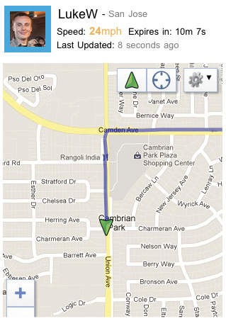
Fig 3.7: Glympse’s mobile web experience allows you to see how far away someone is from you and how long it will take them to arrive.
As we saw earlier, the presence of accurate location information can create new kinds of uses for your service. Every other second, someone using Yelp on his or her mobile device calls a local business. People are viewing 20,000 homes an hour using Zillow on mobile. The opportunities for services to take advantage of location information are huge.
Because of the size of desktop monitors and laptops, we’re not prone to moving them around a whole lot. Mobile devices are different. They fit in the palm of our hand so they can easily be pivoted, rotated, and moved. Accelerometers let us know when that happens so our websites and applications can respond accordingly.
The simplest use of an accelerometer is to detect when a mobile device has been turned to be viewed horizontally or vertically. This little bit of knowledge can be used to make small or dramatic changes to an application.
In their native email application on Android, Google takes advantage of this orientation change to give people more room to write when composing an email. If the device is flipped to horizontal mode, a wider text area appears for the message and a “Done” button appears on the right (fig 3.8).
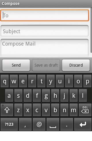
Fig 3.8: Flipping the Android Gmail application to landscape mode gives you more room to compose your email message.
Without this design change, rotating this mobile device horizontally would have made typing an email harder. There would be less room and more text fields. But instead Google has provided people with more room—thereby turning a potential limitation into a benefit.
Accelerometers can also tell us the rate at which a device is moving in someone’s hand. This one capability can take a common task on the web and make it easier and fun. Consider the act of reading an article online: every day, millions of people skim the top paragraph and perhaps scroll down using their mouse, or click on a scrollbar in their browser. Not really much to innovate right?
Once again, though, we see the capabilities in mobile devices outpacing what we can do on the desktop. For example, the reading service Instapaper allows you to save articles to read later on your mobile device (and many other devices as well). Instapaper’s iPhone application uses accelerometer data to gradually scroll text in an article for you as you tilt the phone—no scrolling needed (fig 3.9). You can even tilt the device more or less to read at your own pace. So even the most common tasks online can be rethought given mobile capabilities.
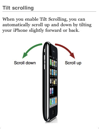
Fig 3.9: Tilt scrolling in Instapaper allows you to read articles at your own pace without having to touch the screen.
Astute readers will note that these last two examples were native applications and not mobile web applications. So to balance the tide, let’s look at two uses of device orientation in the web browser.
The first one recreates the venerable snow globe—digitally. Just shake your phone to make the flakes come down in the web browser (fig 3.10).

Fig 3.10: Just shake your iPhone to make it snow in this robot’s globe.
The second example goes a bit further and uses an iPhone 4’s gyroscope (which detects 360 degrees of motion) to make it easy to pan large photos simply by moving the phone in your hand (fig 3.11).
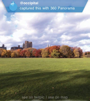
Fig 3.11: Move your mobile device in any direction to pan these images 360 degrees (Source: The Next Web)
Interface designers have always lauded direct manipulation. After all, why bother with a mouse and keyboard when you can just reach out and touch something? Touch-enabled mobile devices allow us to interact with the web using our fingers—that’s wide-open terrain for new interactions that just “feel” right.
The next section of this book is going to cover how to make sure people can use your websites on touch-enabled mobile devices, so for now I’d just like to highlight that touch is a capability ripe for innovation. We’re only beginning to explore how touch gestures can be used to manage, create, and access information on the web. From simple actions like “pull down to refresh” and “swipe for more options,” new interactions are slowly becoming expectations.
But touch can go beyond simple interactions and sometimes drive the entire way an application is used. Consider the Sketch a Search native mobile application from Yahoo!. To find a spot to eat near you, just draw a circle or line on the map using your finger (fig 3.12).
Fig 3.12: Yahoo!’s Sketch a Search application allows you to search by drawing lines and circles on a map.
Results come back within or along the shape you’ve drawn. Compared to the standard desktop web approach of typing in a location and search term, letting your fingers do the searching is not only easy but fun as well.
When you design and develop for mobile first, you can use exciting new capabilities on the web to create innovative ways of meeting people’s needs. Technical capabilities like location detection, device orientation, and touch are available on many mobile web browsers today. And additional capabilities may be here soon, including:
Starting with mobile puts these capabilities in your hands now so you can rethink how people can interact with your website and the world around them. As mobile web browsers continue to gain access to capabilities currently reserved only for native mobile applications, these opportunities will only increase.
At this point we’ve talked about reasons for designing and developing web experiences for mobile first. A mobile first approach:
Hopefully you’re convinced that mobile web experiences are not only a great opportunity for growth, but also offer new ways of meeting your customer’s needs as well. If so, you might be thinking, “Ok, but how do I get started?” Well, I’m glad you asked.