When it comes to organizing the content and actions on mobile, solid information architecture principles like clear labeling, balanced breadth and depth, and appropriate mental models remain important. But the organization of mobile web experiences also needs to:
In the previous part, we talked about the constraints and capabilities that make designing for mobile unique. Similarly, the desktop web also has a set of limitations and possibilities that make it distinct. So simply porting over what worked for you on the desktop to mobile often doesn’t make sense. Instead, you need to think about what mobile is uniquely good at and align it with the needs of your customers.
Looking at this intersection at a high level can illuminate how people are typically using their mobile devices and why. In his book Tapworthy, author Josh Clark focused on three critical mobile behaviors: micro-tasking, “I’m local,” and “I’m bored.” These align pretty well with Google’s breakdown of mobile users into three behavioral groups: urgent now, repetitive now, and bored now. Regardless of how you chose to label these behaviors, mobile usage generally consists of a couple of interaction types:
Because they directly align with why people pull out their mobile devices, these behaviors often determine how your mobile experience can be structured and organized to meet people’s needs. For example, the Flickr photo sharing mobile web experience has four primary actions. Recent activity and uploads from your contacts let people check-in on what’s new with their friends and photos; today’s interestingness and photos taken nearby give people a way to fill idle time by looking at great pictures (fig 4.1).
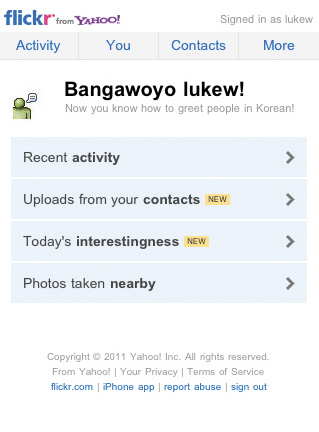
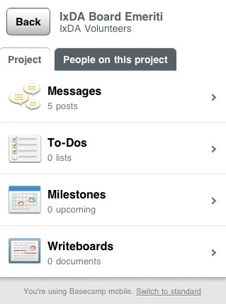
Fig 4.1: Both Flickr and Basecamp’s mobile web experiences align with why people pull out their mobile devices.
Similarly, the Basecamp project management mobile web experience emphasizes the ability to check-in, edit, and create new messages, to-dos, and more. While people’s reasons for using Flickr and Basecamp are different, both sites have thought through how they’ll be used on mobile and adjusted their organization accordingly.
Aligning with mobile behaviors also naturally aligns your website with real-world needs. Since a mobile experience can be accessed anywhere and everywhere, you need to think through how it can be useful to people wherever they may be. That means lots of real-world use cases that ground your site’s organization in what people actually want to do.
I recently found a great example of this in action. On the Mobile in Higher Ed blog, Dave Olsen responded to an xkcd comic (fig 4.2) with:
…as I was looking at the right side of the Venn diagram I thought, “That looks like a lot of the current and planned content for our mobile site.” […] removing unnecessary fluff and cruft to fit in the constraints of both the device real estate as well as network limitations, helps craft a better and more useful user experience.
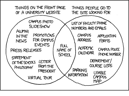
Fig 4.2: A comic from xkcd parodying what people want on a university website versus what they find (Source: xkcd).
I couldn’t have said it better myself.
As a general rule, content takes precedence over navigation on mobile. Whether people are checking on frequently updated data like stocks, news, or scores; looking up local information; or finding their way to articles through search or communication tools—they want immediate answers to their needs and not your site map.
Too many mobile web experiences (like the Flickr and Basecamp examples we just looked at) start the conversation off with a list of navigation options instead of content. Time is often precious on mobile and downloads can cost money, so get people to what they came for as soon as you can.
The YouTube and ESPN mobile web experiences do just that. A simple header tells you whose site you are on and relegates navigation options to a single action. The rest of the page is filled with timely content to check-in on (ESPN) and popular time killers to explore (YouTube) (fig 4.3).
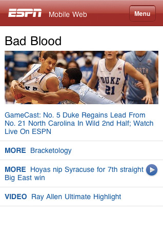
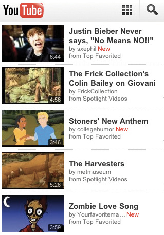
Fig 4.3: ESPN and YouTube’s mobile web experiences put the focus on content instead of navigation.
But wait—if content always takes precedence over navigation, how can I find my way around mobile web experiences? Don’t we need a way to navigate and discover what’s available? Of course, but allowing people to explore and pivot to relevant content doesn’t have to mean piles of navigation bars that bury content.
For example, it’s great that Facebook puts relevant content I can frequently check-in on front and center in their mobile web experience; but because of the three navigation bars at the top of their pages, I can only see one update on my screen. The Google Finance mobile web experience also has relevant, timely content—but it’s sandwiched below five navigation bars. That’s a lot of precious screen space spent on navigation options people might not need—space that could have been devoted to useful content instead (fig 4.4).
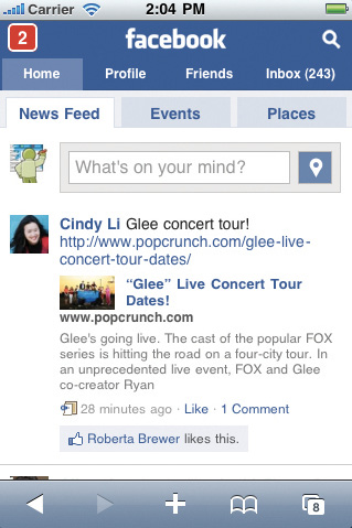

Fig 4.4: Facebook and Google Finance fill precious space with lots of navigation options in their mobile web experience.
Facebook recently redesigned their mobile web experience and actually reduced the number of navigation options (fig 4.5). If you don’t count the Top News and Most Recent filters on their news feed, they cut the number of navigation choices in half (from ten to five). That’s a pretty good start!
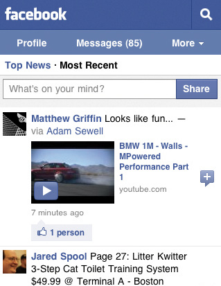
Fig 4.5: Facebook’s recent redesign cut down on the number of navigation options in their mobile web experience.
The examples from YouTube and ESPN (fig 4.3) both emphasize content over navigation, but they handle the ability to pivot and explore the rest of their site through navigation differently. YouTube provides a shortcut to a full screen experience dedicated to getting around the site (fig 4.6). This approach requires you to actively seek out navigation options and takes you out of context (to a separate page) when you do. You also need to know that the grid icon in YouTube’s header means “navigation menu, please.”
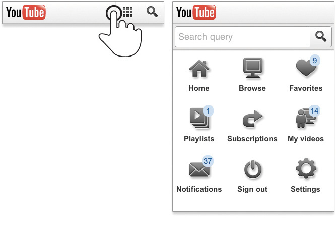
Fig 4.6: YouTube’s mobile web experience includes a full page of navigation options accessible from the header.
ESPN has a more clearly labeled “Menu” button in their header that reveals an extensive (and multi-leveled) navigation list directly below it (fig 4.7). This approach allows you to stay on the current page when considering where to go next. No need to move to and load a separate page. ESPN also repeats their navigation options in a menu at the bottom of most pages.
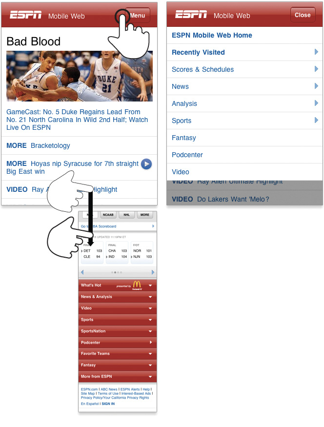
Fig 4.7: ESPN’s mobile web experience includes navigation options in the header and at the bottom of every page.
Controls at the bottom of the screen are easier to interact with one-handed and present people with choices and ideas on what to do next when they get to the end of a screen. YouTube’s design lacks these pivots at the end of their pages; when you get to the bottom, there’s nowhere left to go (fig 4.8).
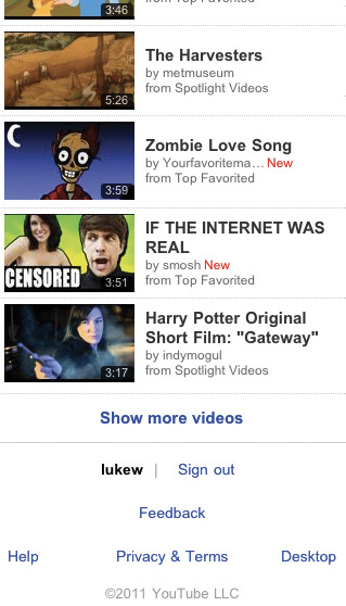
Fig 4.8: The options at the end of a page on YouTube’s mobile web experience are basically a dead end. Sign out? Send feedback?
Though bottom menus are useful for further exploration, they probably shouldn’t just duplicate a menu that can be found elsewhere. Instead, a top-level menu button can simply link people to a navigation list on the bottom of a mobile web page (after the content). We recently used this approach on the Bagcheck mobile web experience (fig 4.9).
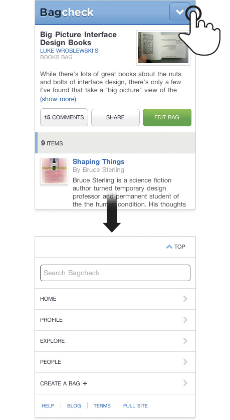
Fig 4.9: An anchor link in the Bagcheck header jumps you to the site’s navigation menu at the bottom of the page.
A simple anchor link in the site’s header jumps people to navigation options at the bottom of the page. Having this list present at the bottom of content pages allows people to pivot and explore other parts of the site. Especially when they come directly to a content page and may not be familiar with the rest of what the site offers.
The menu on the bottom of Bagcheck pages also has a “top” link to bring people back up to the start of a page if they want to return to the content they were just viewing.
This design uses a minimum amount of navigation elements (just a single link at the top), gives people an opportunity to pivot and explore when they get to the end of content, doesn’t duplicate the content of another menu, and (best of all) only requires a simple anchor link to work. That’s right: no fancy JavaScript, overlays, or separate navigation pages to maintain—just an anchor that links to the bottom of the page. That’s like HTML 0. (Which I’ve heard works in most browsers except Internet Explorer.)
Content pages on Bagcheck also have unique related navigation lists for deeper exploration (fig 4.10). These navigation options allow people to immerse themselves in further information about a single topic if they choose. Or they can simply use the global navigation options below to pivot to a different area of the site.
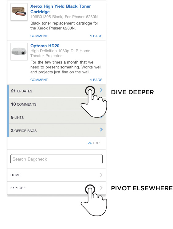
Fig 4.10: Contextual navigation menus on the Bagcheck mobile web experience allow people to explore related content.
Contextual navigation options are also useful for tasks. In the Gmail mobile web experience (fig 4.11), a contextual menu of actions can be accessed from the top of the screen. Because these actions are directly related to the current email message being shown, putting them at the bottom of a web page wouldn’t be very efficient. Instead, they are always present at the top and thereby instantly accessible.
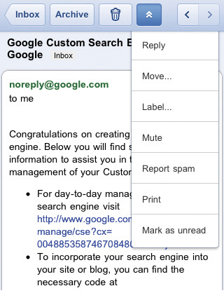
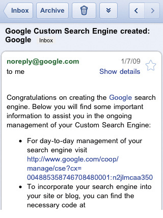
Fig 4.11: Contextual actions in the Gmail mobile web experience allow people to quickly act on their email.
It’s always interesting to see how design solutions migrate across digital borders. For example, many native iPhone applications have prominent “back” links in their navigation header (fig 4.12). Apple’s mobile devices lack a physical back button and don’t display any system chrome actions for native apps.

Fig 4.12: The “back” button is a common feature in native iPhone applications.
But the presence of a “back” button in the header has unnecessarily migrated to mobile web experiences. Many devices (Android, Blackberry, Windows Phone 7, etc.) have physical back buttons (fig 4.13). Even Apple’s mobile web browser includes a prominent back control in the application toolbar (fig 4.14). Adding another back button in your mobile web experience’s header only confuses things. Someone using the site must ask, “Do both of these back buttons do the same thing?”
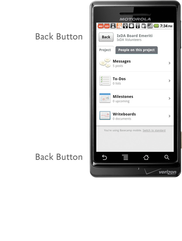
Fig 4.13: Android devices feature a hardware back button on the device.
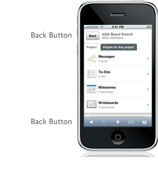
Fig 4.14: Apple’s mobile web browser has a permanent back button in the bottom toolbar.
So when designing mobile web experiences, you can leave “back” back in the native app. If you need to provide people with a quick way to go “up” a level in your site consider a label other than “back.”
Speaking of native iPhone applications, many of them also use fixed position navigation bars at the bottom of the screen. These menus make key actions easier to access with our thumbs, but unlike mobile web experiences, native iOS applications don’t have web browser controls eating into their screen space. Yahoo! Mail’s mobile web experience illustrates the impact browser chrome can have on a mobile web page. The two browser menus and two fixed position menus in Yahoo! Mail’s mobile web experience leave little room for actually seeing what’s in your inbox (fig 4.15).

Fig 4.15: Yahoo! Mail’s mobile web experience uses a navigation menu fixed to the bottom of the browser window.
But mobile web experiences don’t just have to contend with the chrome of one web browser on iOS: they have to contend with many web browsers. Devices with physical controls below their screen also present a challenge for menus fixed to the bottom of the screen (fig 4.16). The close proximity of these controls and an application’s menu bar means errors are bound to happen as people miss menus and hit physical buttons.
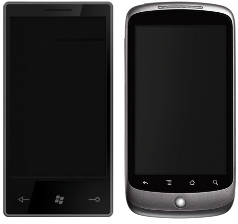
Fig 4.16: Many devices have physical controls below the screen.
When developing a native mobile application you could adjust a menu’s position to account for physical buttons below the screen, but mobile web experiences need to work across platforms—physical buttons below the screen or not.
So while navigation menus fixed to the bottom of the screen might be a good idea in some native mobile applications, the variable presence of web browser menus and physical controls below the screen on mobile devices means they are often a poor idea in mobile web experiences. If you need a fixed menu, better to fix it to the top, as Twitter has done in their redesigned mobile web experience (fig 4.17).
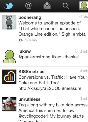
Fig 4.17: Twitter’s latest mobile web experience uses a top navigation menu for key actions to account for the differences between mobile web devices.
As I mentioned in the first half of this book, when they are on their mobile devices, people are often just “one eyeball and one thumb.” They’re usually not comfortably seated in front of a desk and focused on your site. Instead, they are in the real world with many possible distractions around them. In these situations we only have people’s partial attention; they need clear, focused designs to get things done—not lots of navigation options getting in their way.
Yahoo! Mail’s compose email screen is a great example of removing extraneous actions and letting people focus on their primary task (in this case, writing an email) on their mobile device. This screen contains only a single navigation action: “cancel” (fig 4.18). The rest of the interface is laser-focused on the task at hand.
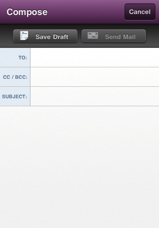
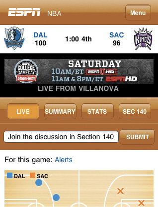
Fig 4.18: Contrast the amount of navigation options in Yahoo’s Compose Mail and ESPN’s live game screens.
ESPN’s real-time updates of NBA games, on the other hand, are covered with so many navigation options that the display of what’s happening in the game is pushed off screen. The task at hand is seeing play-by-play action not jumping between menu options.
Minimizing the amount of navigation options on mobile screens helps to prevent errors as well. With fewer navigation choices, people are less likely to accidentally tap away to other tasks while trying to accomplish their current objective.
When organizing your mobile web experience, think through how you can align mobile behaviors with your customer’s needs.
Getting your mobile web experience organized will help people find their way around; but once they find what they’re looking for, they need to act on it. Next, let’s look at how they can do just that.