Take a ride on the subway, stop by the mall, or go anywhere near a high school and you’ll encounter the most recent evolution of the human race. Small, light-emitting plastic screens attached to people’s hands are just about anywhere you look. Thankfully, this isn’t some odd genetic mutation—it’s just our friend, the mobile device. And he’s everywhere.
In case you haven’t been keeping up with the latest stats, I’ll give you a quick recap: mobile is growing like crazy. (Really technical, I know.) While analysts have predicted for years that mobile will be “the next big thing,” their prophecies are finally coming true in a very big way. To understand just how big, let’s look at some recent statistics:
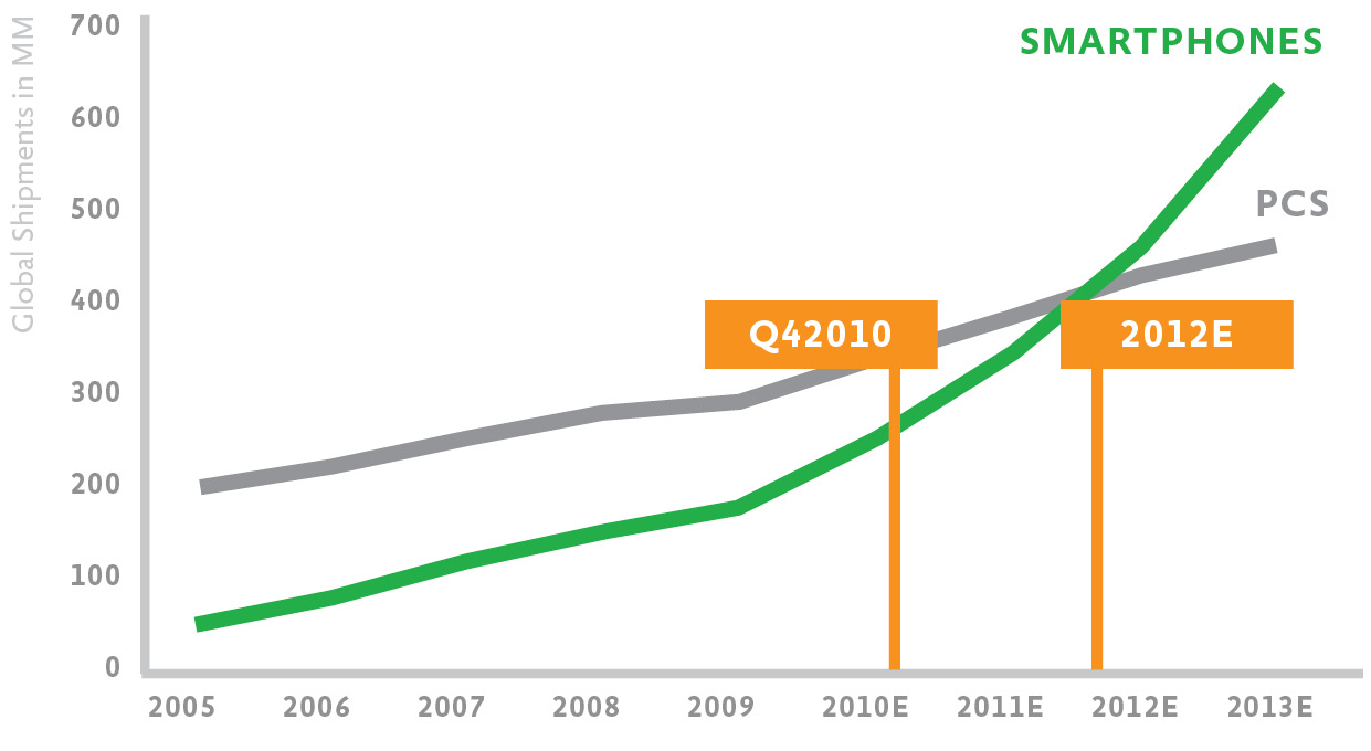
Fig 1.1: Global smartphone shipments surpassed global PC shipments two years earlier than predicted.
There aren’t just a lot more bits flying around on mobile networks. Actual businesses are flourishing on mobile in ecommerce, social, search, and beyond. That’s right—real money is being made on mobile, which makes clients and stakeholders take note.
And just in case you think your website or application is immune, the average smartphone user visits up to 24 websites a day and the top 50 websites only account for 40% of all mobile visits. That means your site is very likely a part of the mobile growth story as well.
Truthfully, you don’t need all these statistics to realize that mobile use is exploding. You just need to look around you and see how often people are staring at the little screen in their hand. Mobile is already all around us.
To explain why mobile is on such a tear, I need to take us on a US history lesson all the way back to 2006. If you can’t imagine what life was like way back then, let me re-introduce you to the Motorola Z3: a follow-up to the incredibly popular Motorola RAZR phone (fig 1.2).
The Z3 was a high-end mobile device in the United States in 2006. It featured SMS, email, instant messaging, a two megapixel camera, a music player, a full color screen, and a WAP 2.0/XHTML web browser; it connected to AT&T’s EDGE high-speed data network, and the experience of using the web on it…sucked.
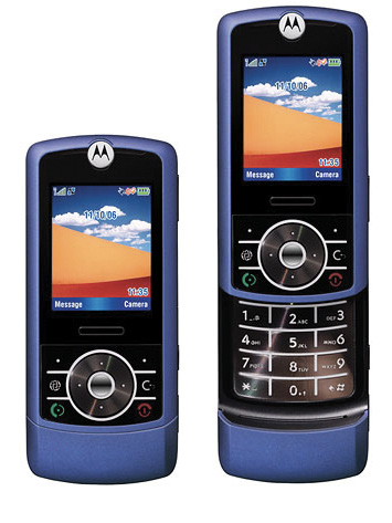
Fig 1.2: The Motorola Z3 mobile phone was state-of-the-art in the US back in 2006.
Just how bad was it? I counted almost two minutes from starting the web browser to finally seeing a web page that consisted of just a few text links. In a world where websites measure their response times in milliseconds, it’s not hard to see how painful that could feel. But it wasn’t just the wait; using the phone’s keypad to triple-tap text was a chore, and even predictive text tools like T9 didn’t fully ease the pain.
But something happened less than a year later that really changed things. On June 29, 2007, Steve Jobs got on stage and introduced the first iPhone. Apple fanboy or not, it’s hard to deny the impact this device has had on the mobile internet. Here was a mobile phone on which browsing the web really did not suck. Looking at AT&T’s mobile data traffic from 2006 to 2009 (when it was the exclusive carrier of the iPhone in the US) tells the story quite clearly (fig 1.3).
Fig 1.3: AT&T’s meteoric rise in mobile data traffic can be seen in more detail in the Economy Internet Trends Report from Morgan Stanley.
During this time period, AT&T saw a 4,932% increase in mobile data traffic—no wonder their service was spotty for so long! The difference between a device that sucks for browsing the web and one that is great for browsing the web is actually quite significant. In fact, in 2009, one iPhone was responsible for as much mobile traffic as 30 basic feature phones—no doubt aided by the flat-fee data plan available with the device.
But mobile isn’t growing just because devices are getting better: they’re getting cheaper as well. People who could never afford a desktop or laptop computer can now get online using inexpensive mobile devices and increasingly affordable data plans.
Broader coverage from faster networks has also been adding fuel to the fire. In 2010 alone, mobile network speeds doubled. As networks became twice as fast, the average amount of data traffic used per smartphone doubled as well. And this use of this data isn’t going to stop anytime soon; global mobile data traffic is projected to increase 26-fold between 2010 and 2015!
That’s a whole lot of opportunity coming your way, really fast.
But before we get ahead of ourselves with pie-in-the-sky mobile web usage fantasies, let’s ground things a bit. First, mobile data traffic includes a lot more than just the web. Second, basic feature phones still make up the vast majority of devices on the mobile network and there’s a world of difference between feature phone use and usage of more capable mobile devices.
Just what kinds of differences are we talking about?
To ensure everyone on the mobile web can access your content now you would need a solution for feature phones, smartphones, and everything in between. But in this book, I’m going to focus mostly on designing for smartphones. Not because Google is giving me a kickback for every Android phone sold, but because:
For these reasons and more, smartphones represent a huge opportunity for immediate and long-term customer engagement for many companies. There are, of course, many opportunities with the vast number of feature phones out there today as well—especially through integrated services like SMS and specialized mobile browsers like OperaMini (which does a nice job of bringing better web browsing to feature phones). However, the mobile industry is moving toward smartphones, and so will this book.
But every device labeled a smartphone isn’t created equally, either. At the beginning of 2010, iPhone data usage was over four times higher than any other smartphone platform. But by the end of the year, other mobile devices had caught up, and iPhone data usage was only 1.75 times higher than Google’s Android platform.
Usage can also change dramatically within a single platform. When Research in Motion (RIM) introduced a more capable web browser with their Storm mobile device, it quickly shot up to 16% of all of RIM’s mobile traffic on the Verizon network. The Blackberry devices made by RIM today have an even better web browser so expect usage to grow even more.
These examples not only illustrate the impact a more capable mobile device can have on usage; they also highlight just how quickly things are changing. The rate of innovation in mobile devices is unparalleled; as a result, it’s creating all kinds of new opportunities.
With new capabilities come new ways to interact with the web and with digital services, information, and people. We’ll talk a lot more about this later in the book, but for now I just want to point out that more capable devices and faster networks don’t just amount to more traffic to your site. They introduce entirely new opportunities for engagement as well.
Consider the local review service, Yelp. Their mobile products are used by just 7% of their total audience but are responsible for 35% of all their searches. Every other second Yelp’s mobile products manage a call to a local business or a request for driving directions. That’s a whole new set of interactions Yelp didn’t have before people started using their service on mobile devices.
As another example, let’s look at the real estate service, Zillow. Their customers are viewing active listings 45% more often from mobile devices—compared to their desktop website. These are primarily active buyers on location or scoping out neighborhoods; they represent a new kind of audience for the company created by the growth of mobile.
Of course we can’t talk about mobile internet growth without mentioning the ongoing debate between native mobile applications and mobile web solutions. While many people try to argue for one side or the other, the truth is there are great reasons for doing both.
Because native mobile applications run, well—natively—they have access to system resources that web applications do not. This means user interface transitions and interactions are generally smoother in native applications. Trying to replicate these effects in the browser can lead to noticeable hiccups and lags in the user experience.
Native mobile applications give you robust access to hardware capabilities that you currently can’t get through mobile web browsers. Core features like access to the address book, SMS, camera, audio inputs, and other built-in sensors are mostly unavailable. Also absent is the ability to run processes in the background and easily monetize through mobile app stores or in-app purchases. Non-native applications can’t get into a native app store and have a much harder time getting on the home screen of people’s mobile devices, which can negatively impact discovery and ongoing usage.
So if your mobile product or business requires deeper hardware access, background processes, app or in-app sales, or more integrated placement on mobile devices to be viable, you may need a native solution. But that doesn’t mean you don’t need a mobile web solution, too.
As mobile strategist Jason Grigsby is fond of pointing out, “Web links don’t open apps, they go to web pages.” Whether it’s through search, email, social networks, or on web pages, if you have content online, people will find and share links to it. Not having a mobile web solution means anyone that follows those links on a mobile device won’t have a great experience (if they can even access your content at all). Having a native mobile application won’t help (fig 1.4).

Fig 1.4: Even though they have native mobile applications for iOS, Android, Blackberry, and Palm, the location-based service Gowalla also has a mobile web experience for anyone following links to Gowalla on their mobile device.
Access might even be the biggest user benefit for a mobile web experience. Even if you build a native mobile application for one platform, chances are you won’t be able to create one for every platform. Apple’s iOS requires Objective C; Google’s Android needs Java; Microsoft’s Windows Phone 7 relies on Silverlight; Samsung’s Bada requires C++; RIM’s Blackberry has Java, WebWorks, and Adobe Air solutions. Finding a company that can build something for all of these technologies is rare. And even if you can create native applications for each platform, the cost of maintaining them can quickly make it prohibitive.
Plus the web might be your most popular mobile experience anyway. Fourteen percent of Twitter’s members use the mobile web experience compared to 8% using the native iPhone app and 7% using the Blackberry native app. The rest of Twitter’s native mobile applications are each used by less than 4% of their user base.
The same pattern can be found on Facebook. Close to 19% of Facebook posts are created on the mobile web experience, while Facebook’s native iPhone, Android, and Blackberry apps only account for about 4% of posts each. It turns out access (anywhere) goes a long way.
In fact, native mobile applications are actually increasing web use on mobile devices. Each time a web link is shared or referenced in a native application it opens in a web browser window. So more native application use quickly turns into more web use.
Mobile web experiences also don’t require users to download updates (a fix on the server is a fix on the site), and they enable you to do frequent A/B (or bucket) testing of multiple design options. If either of those considerations is of vital importance to you, a mobile web application can make more sense.
But perhaps the best reason to start with a mobile web solution is that it builds on web design and development skills you already have. You don’t have to wait to get started. In fact, I think you should start right away.
Fueled by capable devices and faster networks, mobile internet usage is exploding. Building mobile first not only positions you to take advantage of this growth, it also opens up new opportunities for engaging your customers.
This isn’t just an opportunity to create a mobile version of your web product; it’s an opportunity to provide an improved overall experience for your customers.
Consider the social networking service Facebook. There are more than 250 million active users accessing Facebook through their mobile devices. These users are twice as active on Facebook as non-mobile users.
The combination of mobile and desktop experiences results in more engaged users across both sets of devices. That’s because Facebook doesn’t just think of its mobile experience as a part of the desktop site; it embraces it as a way to make the entire Facebook experience better.
In the words of Joe Hewitt, former lead developer of Facebook’s iPhone application: “My goal was initially just to make a mobile companion, but I became convinced it was possible to create a version of Facebook that was actually better than the website.” That’s really the mobile opportunity in a nutshell.
Now—how do the constraints and capabilities of mobile devices help get us there?