The power of the web has always come from people’s ability to not only view and consume content, but to contribute and create content as well. Input on mobile is just as important as output, but like all things mobile it typically requires its own bit of secret sauce:
Designers don’t always agree. So it’s somewhat surprising to look back at mobile design guidelines from the past few years and see a lot of consensus around input. At the time, pretty much everyone concurred that most kinds of mobile input should be avoided. In Mobile Web Design and Development (O’Reilly, 2009), Brian Fling wrote: “The rule of thumb is to limit the use of forms in the mobile context.”
But while there are lots of great reasons to avoid requiring precise input when people are just “one eyeball and one thumb,” there are just as many reasons to let people contribute as much as they see fit from their mobile devices. After all, over four billion text messages were sent per day in the United States in 2010—many of them through painful feature phone keypads. Clearly people want to message each other using their mobiles—a lot. And they are willing to endure hardship to do it.
But things don’t have to be so hard. Modern mobile devices are continuing to make it easier to provide input through larger touch screens, microphones, video cameras, and more. So it’s high time we stop thinking of input as something to avoid and instead think of mobile as an incredible opportunity for getting lots of diverse input from people.
Mobile devices are with us all the time. So whenever or wherever inspiration strikes we can speak our mind, share, or just contribute online. Capabilities like location detection, device orientation, audio, video cameras, and more, give us new ways to provide input that don’t require lots of typing with imprecise fingers.
Most importantly, though, we need to stop assuming that people won’t do things just because they are on their mobile devices. After all, someone bought a $265,000 plane using eBay’s iPhone app! Once we come to terms with the fact that mobile input should be welcomed and encouraged, we can start talking about how to design for it.
How we ask people for their input goes a long way toward determining the kind of answers we’ll get. On the web, most questions are asked through forms, and forms use labels to ask for what they need. Form labels on mobile, however, come with their own set of constraints and capabilities that determine how they should be designed.
Screens on mobile are small and web forms need to adjust. In most cases, there isn’t room for left-aligned or right-aligned labels because there isn’t enough room for two columns on a mobile device’s display. Instead, top-aligned labels work best; not only do they optimize for screen real estate and accommodate longer labels easily, they also stay visible when a virtual keyboard is present and taking up half of the room available on screen.
Twitter’s mobile sign-up form (fig 6.1) uses top aligned labels to ask questions and includes supporting text below the input field for clarification and additional details. Both of these elements remain visible when a virtual keyboard is present. And while we’re on the subject of Twitter, did you know that 16% of new Twitter users in a five-month period during 2010 signed up through mobile? And 40% of all tweets come from a mobile device? Still don’t think input on mobile matters?
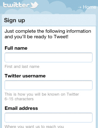
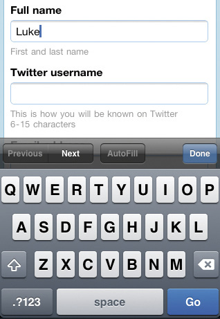
Fig 6.1: Twitter’s mobile sign-up form makes good use of top-aligned labels.
Though top-aligned labels work well within the tight constraints of mobile screens, labels inside input fields can work even better. As proof, just about every native mobile application platform supports labels within input fields and uses them in their default applications. On the web, however, implementing labels within fields requires some work.
Though labels within input fields seem great on the surface, there are some challenges to overcome. A label within an input field:
The mobile sign-in screen for email-marketing site MailChimp highlights two of these points (fig 6.2). When entering a username into the first input field, the label inside disappears. (Note: this is default behavior for the HTML5 input attribute placeholder which, according to the spec, is intended for tips, not labels.) After an answer has been provided, the difference in color between the answer (“lukew”) and the next label (“password”) is just a subtle shade of gray. Neither of these two issues are likely to be a very big problem in such a simple form. But as forms get longer, problems stemming from these issues can get a lot worse.
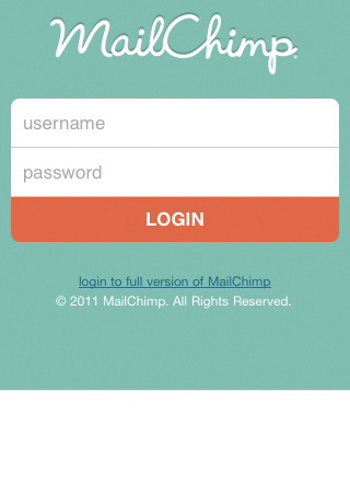
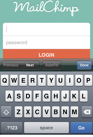
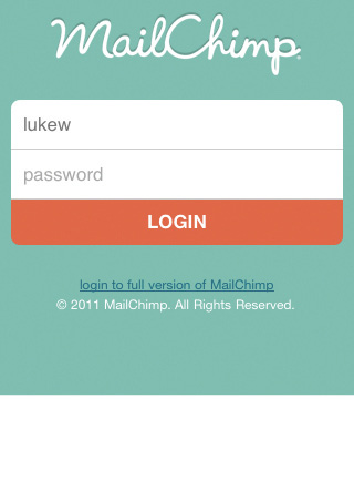
Fig 6.2: MailChimp’s mobile sign-in form illustrates some of the challenges with labels inside input fields.
There are, however, ways to mitigate things so that labels within input fields work better. The mobile sign-in screen for the project management application Basecamp keeps labels within input fields visible until someone actually begins to enter an answer. (This requires some development work as it currently isn’t default web browser behavior.) Basecamp also makes a stronger visual distinction between answers and labels so the two are less likely to be confused (fig 6.3).
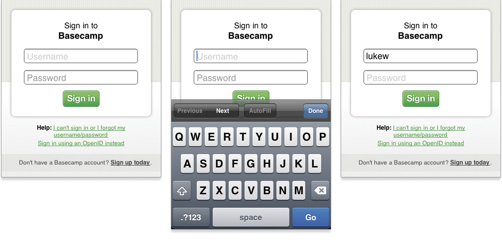
Fig 6.3: 37signal’s Basecamp has put in some extra work to make labels within input fields better in their sign-in form.
Truthfully, asking questions on mobile with well-designed labels isn’t the hard part. Making it as easy as possible for people to answer accurately is. Thankfully, mobile isn’t just full of constraints; there are also a lot of capabilities that can help us out as well.
If you’ve been working on the web for a while, you’re probably familiar with input types. The most commonly used and widely supported input types are checkbox, radio, password, select menus (dropdown lists), file pick, submit buttons, and plain text. Sticking to these standards, where appropriate, can do a lot to help people on mobile (Table 6.1).
| Input Type | HTML |
|---|---|
| checkbox | <input type="checkbox"> |
| radio button | <input type="radio"> |
| password field | <input type="password"> |
| dropdown lists | <select><option>… |
| file picker | <input type="file"> |
| submit button | <input type="submit"> |
| plain text | <input type="text"> |
Table 6.1: Standard input types on the web.
For example, when you use a standard select menu for a dropdown list, a mobile touch-screen browser may provide a large swipe-able list with appropriately sized touch targets, rather than the standard dropdown menus found on the desktop (fig 6.4–6.5). Different mobile platforms will manage these lists differently, but all of them try to make it easier to provide input when using standard controls. The same applies to submit buttons, radio buttons, error messages, and more.
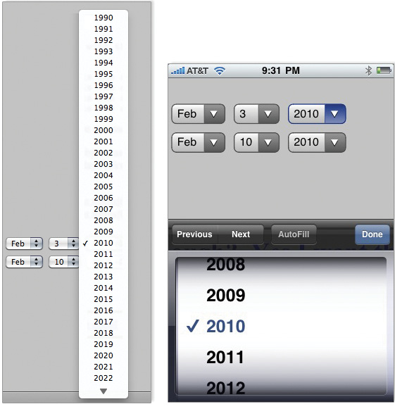
Fig 6.4: The iPhone’s mobile browser uses a touch-optimized (swipe-able, big touch targets) control for standard select menus.
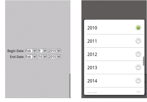
Fig 6.5: Android’s mobile web browser also optimizes select menus for touch.
But there are exceptions. Though mobile platform controls for select menus usually make it easier for people to pick an answer from a list, they sometimes get stretched to their limits. If the contents of a select menu run long, they can be cut off when displayed at a larger “zoomed” size making it hard for people to read through their options (fig 6.6).
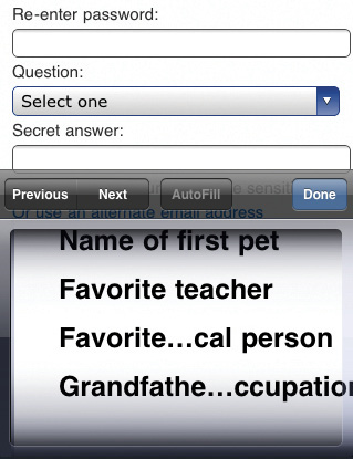
Fig 6.6: The list of possible questions on Microsoft’s signup form stretches an iOS select menu’s control to the limit.
When displayed within a custom control, lengthy select menus also don’t get the full screen height available. Instead, people are forced to find the option they are looking for by scrolling within a smaller window. On a device like the iPhone, you can only see four to five options at once.
So if the content within one of your select menus is going to stretch the vertical or horizontal limits of a standard select control, you’re probably better off with a separate page on mobile that allows people to pick the option they need from a full-screen list.
You may also opt to leave select menus behind when a simple touch control can get the job done faster and easier. As it turns out, select menus are pretty tap-intensive: tap the menu once to open it, swipe the list that shows up to find the answer you want to select, tap it, and then tap done or close to go back to the form. That’s four taps (just in case you weren’t counting). So it’s not hard to see that when a form uses several select menus (fig 6.7), the taps can quickly add up.

Fig 6.7: Booking a flight on American Airlines’ mobile web experience is a select-menu full affair.
Luckily, we can be a lot more tap-efficient with a few custom controls designed specifically for touch-based interfaces. Instead of using select menus to set the number of guests and rooms, the travel site Kayak (fig 6.8) uses a spinner control. This input only requires a single tap to adjust (just hit the “+” or “-”) and works well for questions that have a small range of options. For example, you can only book up to two hotel rooms on Kayak.
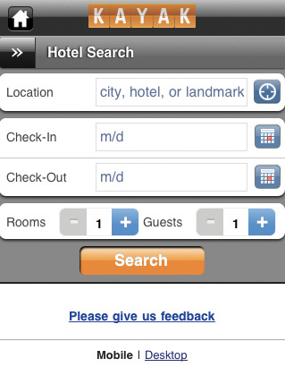
Fig 6.8: Kayak uses a touch-optimized spinner control for selecting rooms or guests in their hotel booking form.
The rooms and guests fields in Kayak’s form also make things easier for people on mobile by starting them off with smart defaults—selections put in place that serve the interests of most people. When booking a hotel, the majority of Kayak’s customers only need one room. Setting this value to “1” instead of asking people to enter it themselves saves time and effort.
In fact, a study comparing empty forms on mobile to pre-filled forms that only required adjusting a few default values, found people were four times faster with smart defaults than empty fields. On mobile those kinds of savings go a long way.
Kayak also uses a custom control for their date picker. Instead of the three select menus American Airlines used for date selection (fig 6.7), the date picker on Kayak’s mobile web experience uses appropriately sized touch targets that allow people to tap between months and select the days they want to travel (fig 6.9). Once again, saving people from a bunch of unnecessary tapping around.
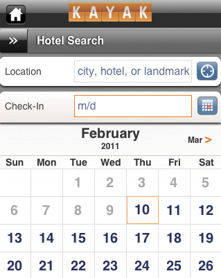
Fig 6.9: Kayak’s date picker makes use of appropriately sized touch targets.
If you decide to use custom input controls in your mobile web experience to make things more efficient on touch screens, don’t forget about non-touch and hybrid devices. Make sure your controls can be used through indirect manipulation (trackballs, trackpads, etc.) by specifying a tab order within the web form and setting :focus and :hover states.
In order to implement custom input controls we need to write custom code. But mobile web browsers are evolving extremely fast and elements that currently require a procedural solution may soon only need to be declared in markup. In fact, there are a number of declarative solutions that can make input easier on mobile today.
For starters, several new HTML5 input types can help people accurately answer questions that require a specific format. On a mobile browser like Safari, specifying an input of type url brings up a virtual alphanumeric keyboard with “.”, “/”, and “.com” keys. Specifying an input of type email brings up a virtual alphanumeric keyboard with “.” and “@” keys. And specifying an input of type number brings up a virtual numeric keyboard (fig 6.10).
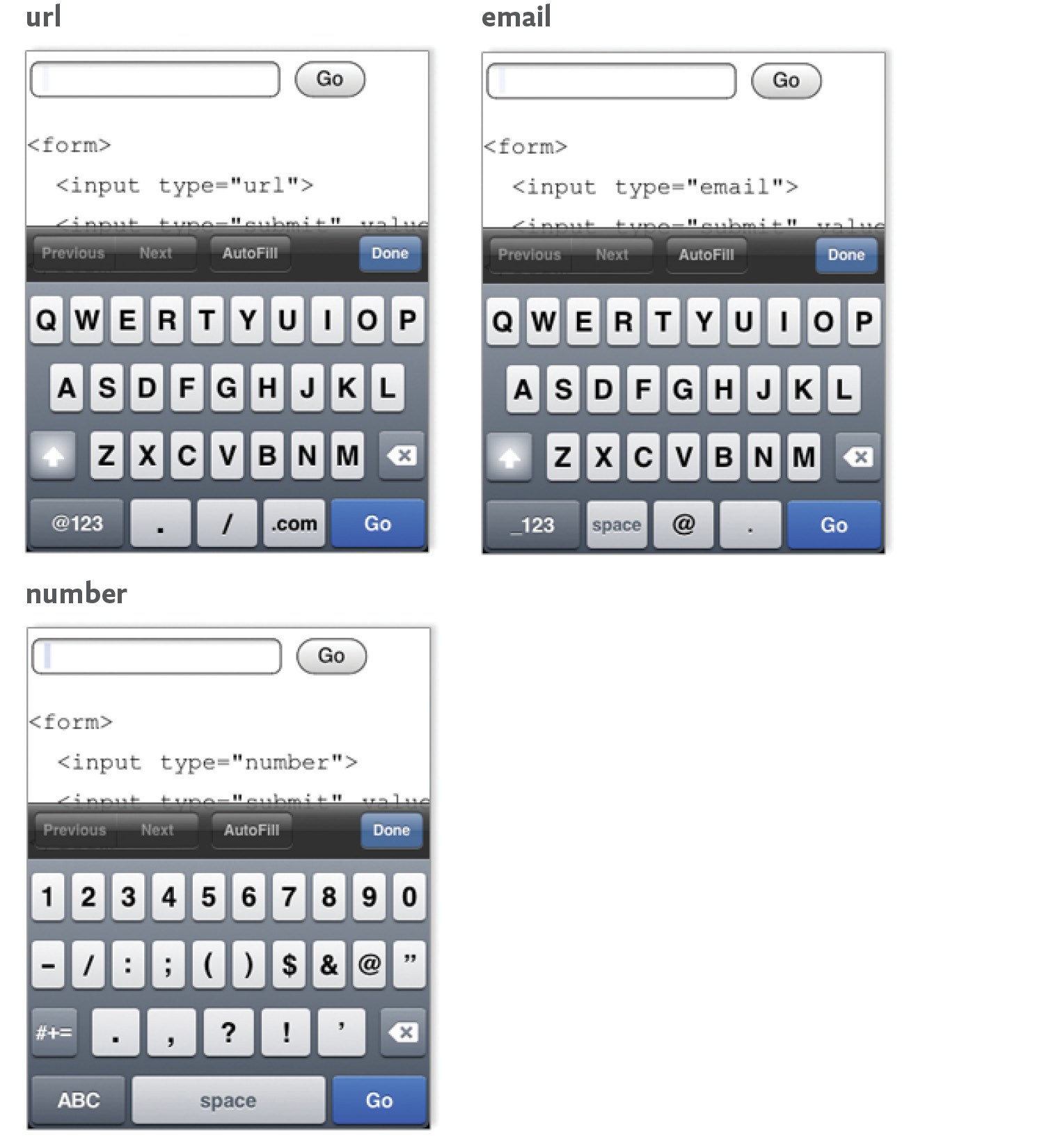
Fig 6.10: Using HTML5 input types and the specific virtual keyboards associated with them. Images from Dive into HTML5 by Mark Pilgrim.
These input-specific keyboards make it easier to enter the exact type of data required by each input field. Older browsers that don’t support new input types simply treat these fields as standard text inputs so there’s little harm in using these HTML5 input types now. (You can see the input types supported by popular mobile web browsers in Peter-Paul Koch’s compatibility table.)
Even browsers without virtual keyboards benefit from specifying number input types (using HTML5 or lesser known standards like CSS-MP, or wireless CSS), because people do not have to switch to number mode to enter numeric data. And speaking of numbers, phones were actually designed for numerical input: virtual or not, most of them still have keypads. So when asking for numerical inputs like phone numbers or prices, use a single input field and allow people to rely on the keypad to provide an accurate answer.
Despite the introduction of new input types, a lot of the work in forms still falls on the plain text input. Luckily even plain text inputs on mobile can be made easier through the use of input attributes, including:
Once again, browsers that don’t support these attributes will simply ignore them so there is no harm in including them in your designs. Where they do work, however, people will thank you after the answer they tap isn’t eradicated by an over-zealous auto-correcting OS.
Specifying input types and attributes can help people on mobile provide accurate answers without a lot of work. But we can do even better by taking advantage of input masks. Input masks can help make complex inputs manageable on mobile by providing clear input cues up front and restricting people’s inputs so they don’t make mistakes.
Most mobile operating systems have built in support for input masks so it’s not uncommon to find them inside native mobile applications. In the browser, however, a lot of the heavy lifting required to make input masks possible falls on us and JavaScript. As a result, it’s useful to know what makes a good input mask work.
In its most basic form an input mask can ensure that an answer is entered in a valid format. To illustrate, let’s imagine we need someone to provide his or her email address at me.com. We can use an input mask to “mask” or cover over anything that isn’t part of the format we require. In this case, the email address we collect has to end in “@me.com” so we can mask any characters that are entered after the “@” to make sure a me.com email address is provided.
You can see this in action in fig 6.11. As someone begins to enter an email address, the “@me.com” portion of the input remains visible. If any characters are entered after the “@” they are ignored. This not only cuts down on errors, it also reduces the amount of input people need to provide, both of which are big benefits on mobile.

Fig 6.11: A basic input mask—in this, case a specific email format—in action.
But there are a few design considerations we need to take into account in order to make sure input masks help (not hinder) people’s ability to provide answers. First, it’s a good idea to reveal the format an input requires up front. In the me.com example, the “@me.com” portion of the input was visible right away and stayed visible as someone entered his or her email address.
In the tax ID example (fig 6.12), the structure of the number required is revealed right away and it stays visible as someone enters the answer. The input mask in this example will not only ignore any dashes (since they are already part of the formatting) but any non-numerical characters as well. So if you try entering an A or G, nothing happens. Since the tax ID required consists only of numbers and two dashes, this input mask prevents you from making a mistake by accidentally entering a letter.
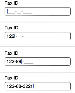
Fig 6.12: A well-designed input mask for entering a tax ID number.
But input masks can feel unpredictable (and thereby confusing) when they don’t consistently communicate their expectations. In the phone number input mask example (fig 6.13), there’s an expectation set that the number needs to be formatted as “XXX-XX-XXXX.” (Note: I’d suggest “___-___-____” as it feels more like a question than an answer.) But as soon as you enter the first number, this format disappears, and two parentheses surround your input. That’s unexpected. As you continue, the formatting required by this input field gradually reveals itself as numbers are entered.

Fig 6.13: Don’t gradually reveal input masks while people are trying to answer your question.
When you’re done, the final answer uses parentheses, a space, and one dash—not at all what was promised up front. For a commonly understood question like a phone number, this might not be a big deal. But as a general rule, input masks that stick to the expectations they set up front are easier to manage than ones that decide to gradually reveal themselves or show up after the fact. And we want input masks to make things easier on mobile, not more confusing.
While labels and input fields are the building blocks of forms, they ultimately need to come together as a conversation between organizations and their customers. In other words, we need to layout the input we’re asking for appropriately. At a high-level, there are three input scenarios we have to consider: a sequence of related questions, non-linear updates, and in-context inputs for immediate responses.
A sequential set of inputs is a group of questions that have to be asked together in order to complete a task. The most common examples online are registration and checkout forms. But anything that requires people to provide answers to a set of questions before they can accomplish their goal (of signing up, buying something, etc.) counts as a sequential set of inputs.
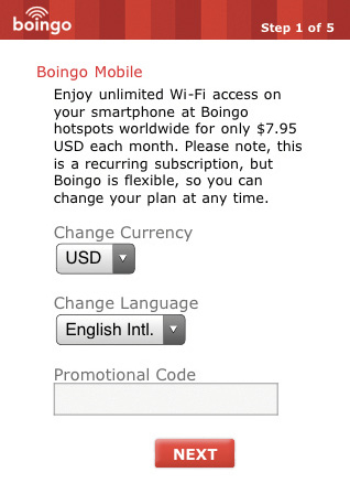
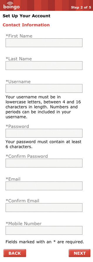

Fig 6.14: The original Boingo “Get Online” form had five separate screens. Here are just three of them.
While the label and input field best practices we discussed in this chapter can go a long way toward making sequential forms easier to complete on mobile, the quantity of information you require people to fill out is likely to have the most direct impact. The fewer questions you ask, the better. Compare the original Boingo “Get Online” form (fig 6.14) with my redesign (fig 6.15) to see just how much can be cut when you aim to be concise. When it comes to mobile forms, be brutally efficient and trim, trim, trim.
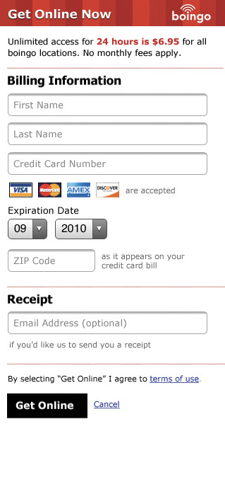
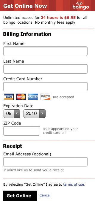
Fig 6.15: My quick redesign of the Boingo form cut things down to a single screen that lets people get online fast.
But we don’t always need people to answer a bunch of our questions at once. There are many situations where only some inputs (in a bigger set) need to be updated or adjusted. In these situations, exposing input fields for every possible answer makes it hard to find the one or two inputs you need to adjust—especially on small mobile screens.
So for non-linear input updates a different kind of layout makes sense. For example, editing your profile information on Bagcheck is a rare occurrence and editing every part of your profile is rarer still. As a result, the “Edit Profile” screen lists available inputs and their current answers but doesn’t expose all the input fields for these answers by default. Instead, each possible input can be tapped and edited in a dialog window (to set focus and pop-up the virtual keyboard immediately) or on a separate screen (fig 6.16).
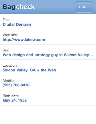

Fig 6.16: Editing your profile on Bagcheck uses a dialog window for each input.
When designing single input screen or dialogs, make sure you take the height of virtual keyboards into account (usually half the screen height). It’s best if the input and actions are visible while the keyboard is present so people can see their answers and options.
Last but not least, in-context inputs provide a way for people to quickly contribute or create without a lot of effort. An in-context input shows up directly inline where people can contribute and usually only consists of a single input field. For example, Quora allows you to comment directly on an answer without leaving the current screen (fig 6.17); this enables immediate contributions and aligns well with the quick ways people often use their mobile devices.

Fig 6.17: An in-context comment form on Quora’s mobile web experience.
Today’s mobile devices are full of capabilities that take us beyond the input field. Location detection, device orientation, audio input, video input, near field communications, and more can be used to allow people to participate and contribute without typing into a form.
To illustrate, let’s look at location detection. When booking a hotel on Kayak, you can enter a location using the keyboard, or you can use your current location by tapping the icon to the right of the input field. Similarly, Twitter allows you to append a location to your post with a single tap (fig 6.18). No typing required.
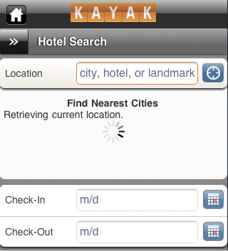

Fig 6.18: One tap access to your current location on Kayak and Twitter means no typing is required.
On the other side of the spectrum, Google Goggles uses the video camera on a mobile device to identify products, wines, works of art, and landmarks; to scan in business cards; or to translate foreign languages (fig 6.19). Imagine all the typing you’d have to do in a form to accomplish what Google Goggles does when you simply point your camera at something.

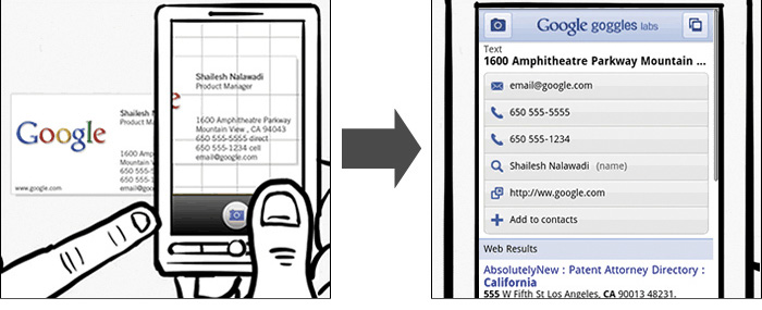
Fig 6.19: Google Goggles allows you to use the video camera on a mobile device for input.
And near field communications (NFC) can take this even further. Mobile devices that can communicate with radio frequency ID tags (RFID) just need to be near something that broadcasts its identity using one of these tiny “digital barcodes” in order to interact with it. Want to learn more about a product? Just get close enough for it to catch a signal and your mobile can bring up all the information you need. How’s that for going beyond input fields and forms?
Once again though, I need to ground us in the current realities of the web. Native mobile applications have access to device APIs that let them access audio, video, NFC (where possible) and more. While there are many standards being written and debated for camera and NFC access in the web browser, widely available support is not here yet. But if the past is any indicator, new capabilities are probably making their way into mobile web browsers as this book is being printed. So don’t fret; soon device APIs will be yours to use as well.
Though people have clung to their mobile devices for years, opportunities for input on these devices have largely been ignored. But today’s combination of more capable devices, better networks, and people’s increasing desire to share make mobile input an opportunity you can’t ignore.
Now that we’ve tackled inputs, actions, and organization on mobile, we need to address the variety of devices where all these elements will live. Which brings us to our next chapter: layout.